Rabat Riads Brand Guide
Blending Moroccan architectural heritage with elegant hospitality branding and geometric artistry.
Logo Design & Brand Identity Guidelines for a Modern Real Estate Company.
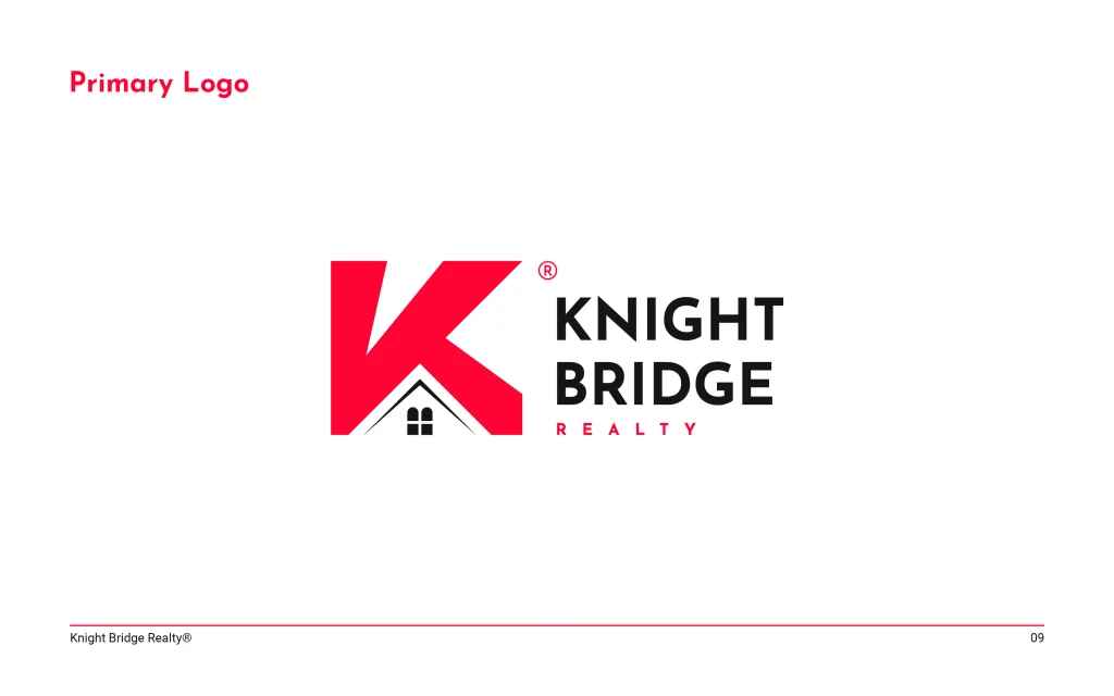
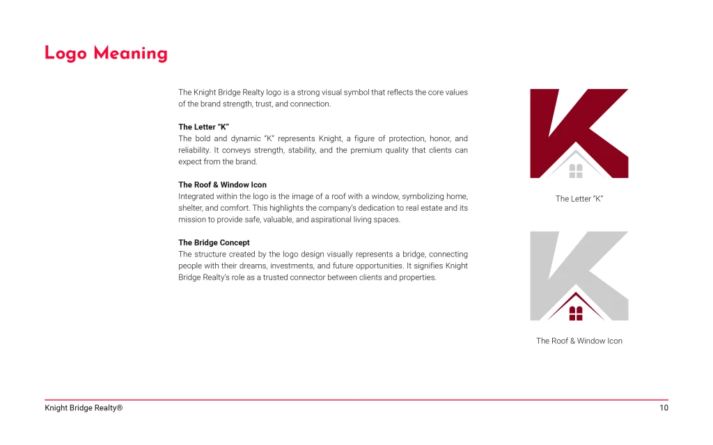
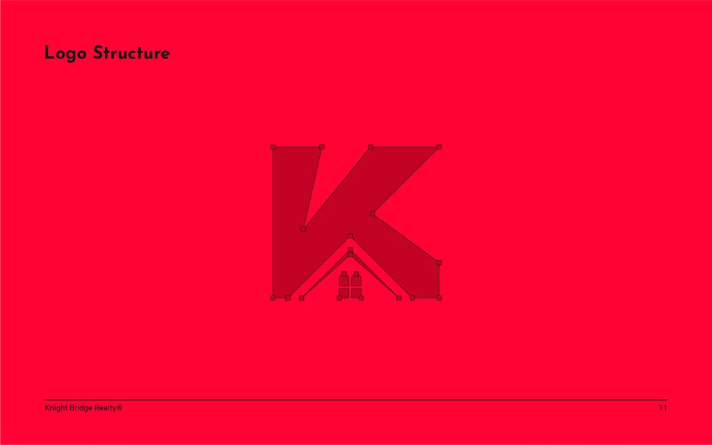
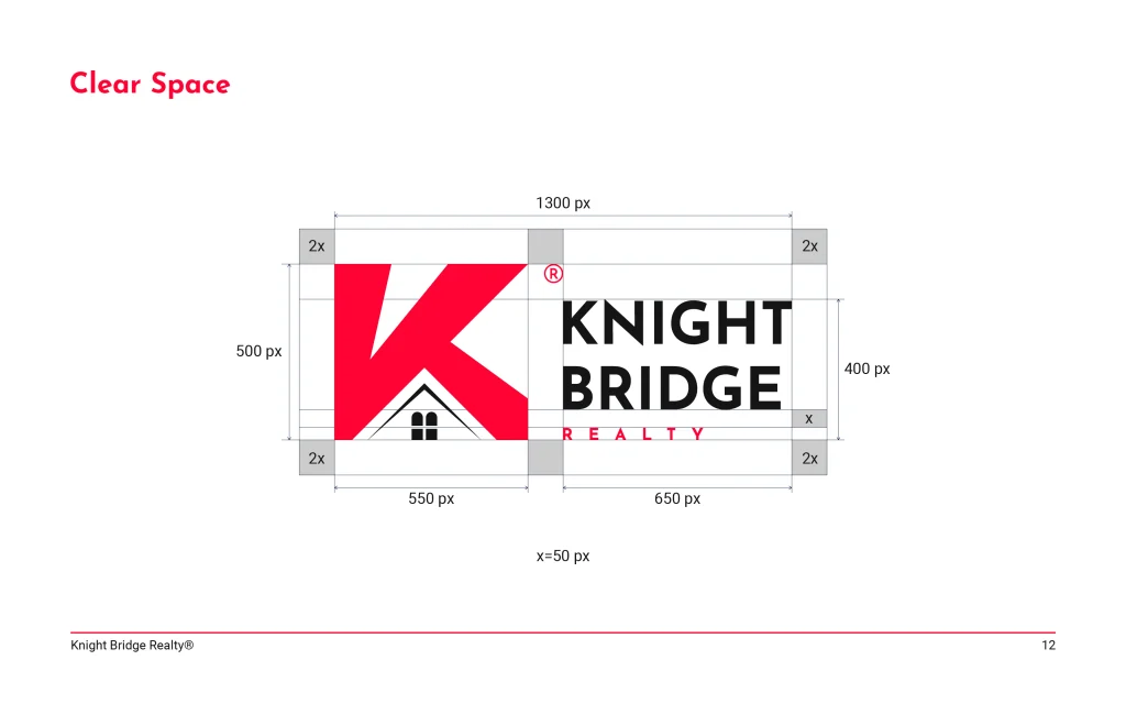
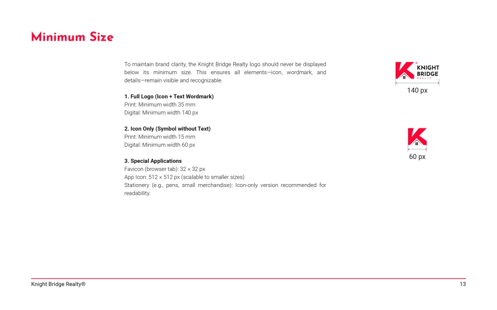
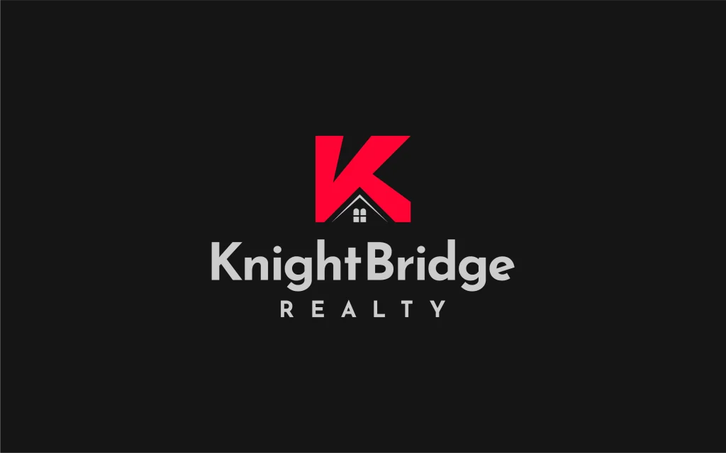
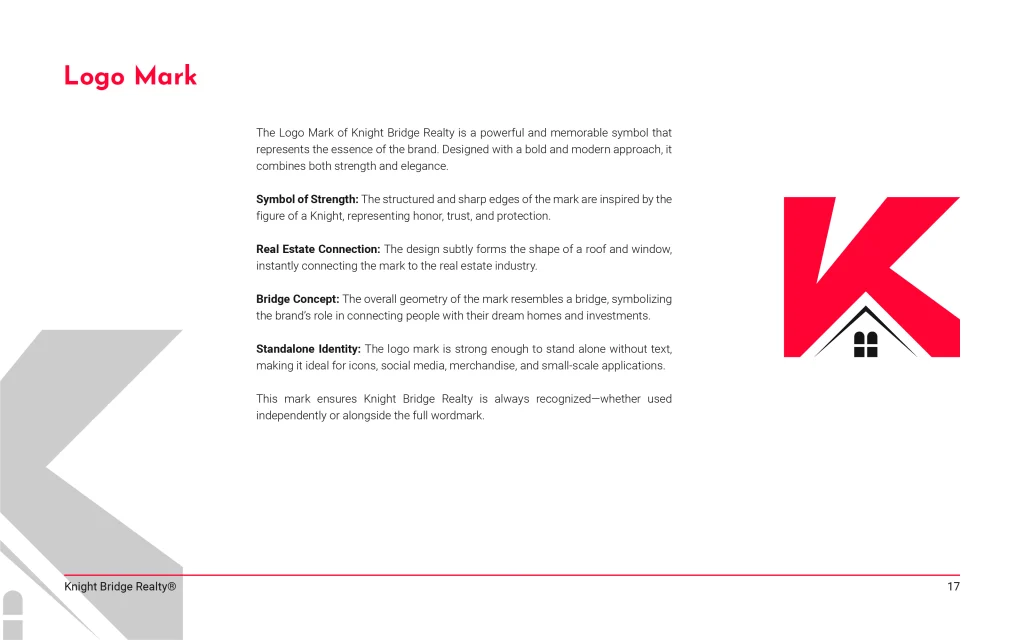
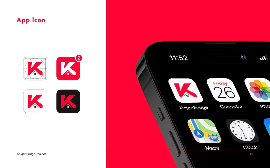
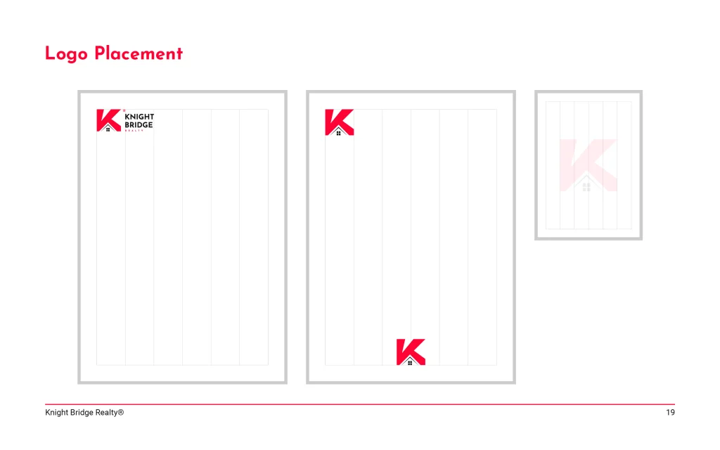
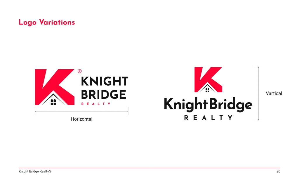
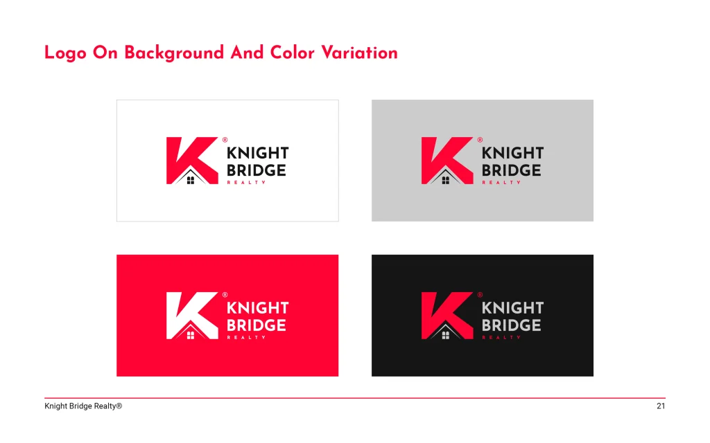
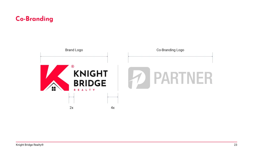
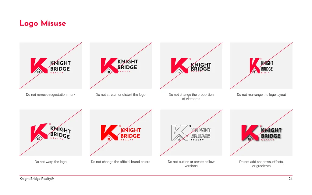
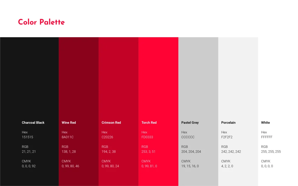
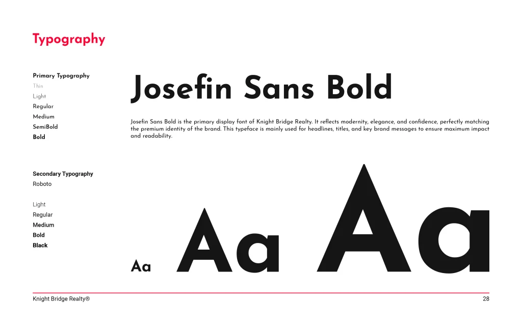
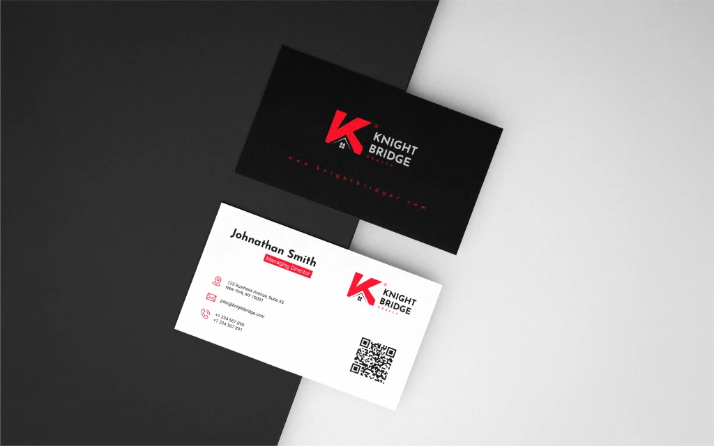
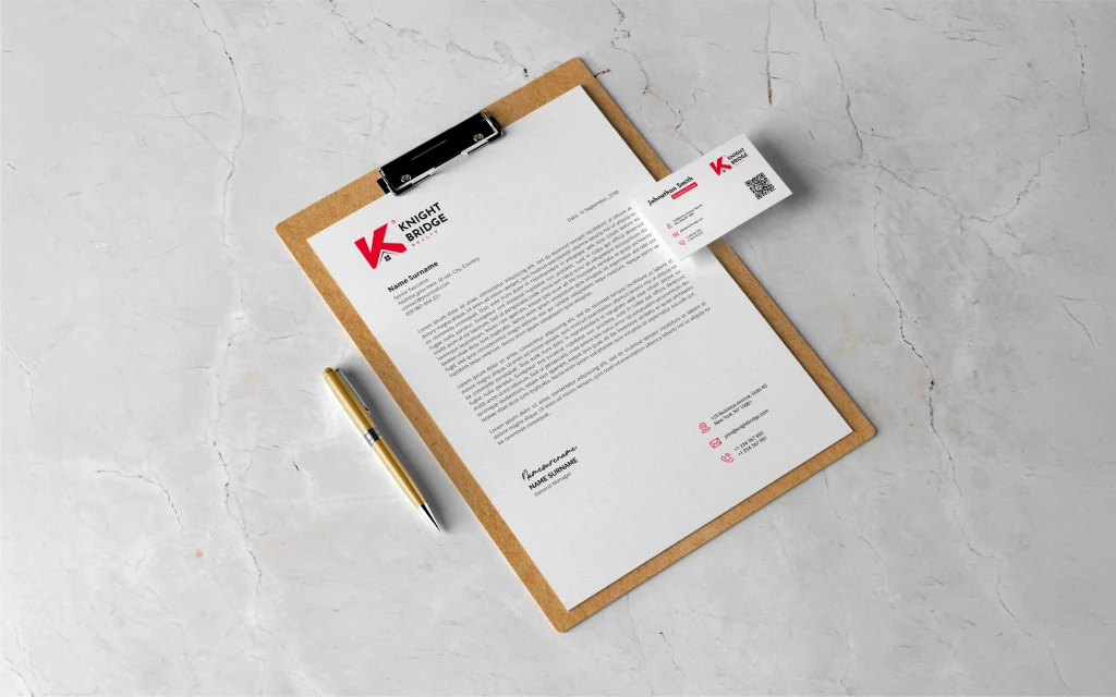
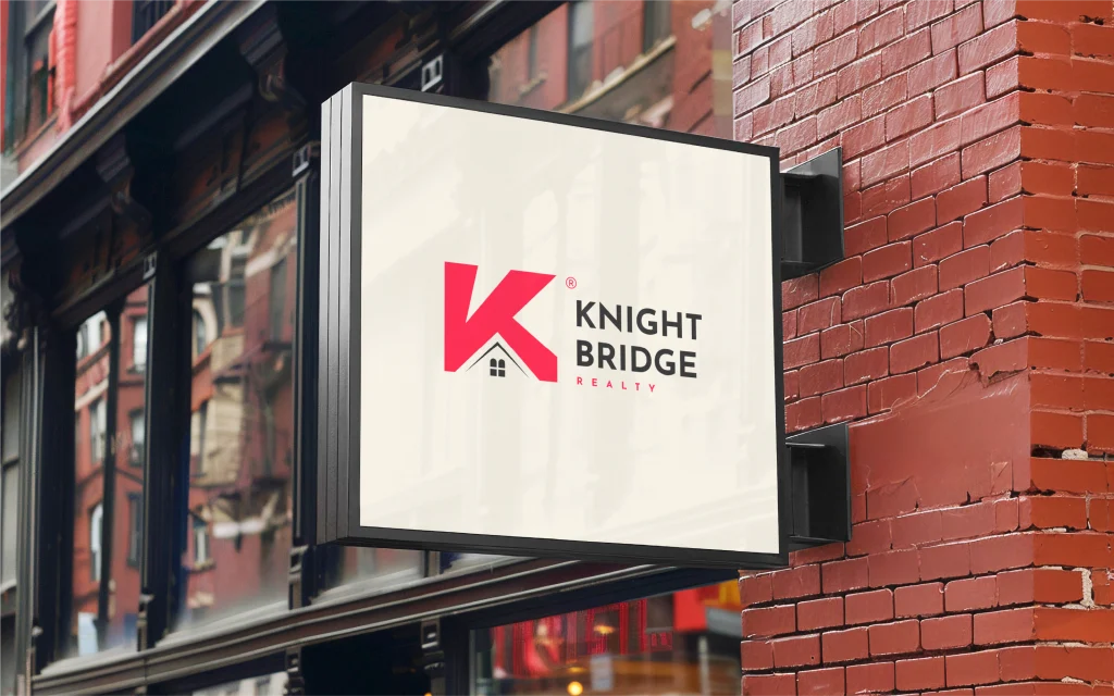
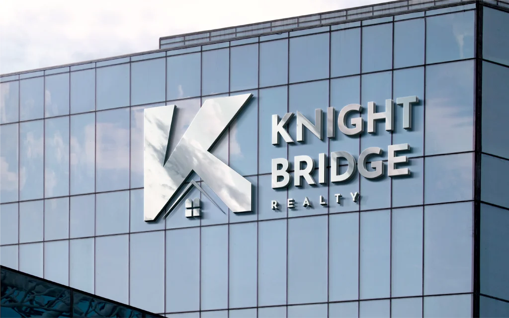
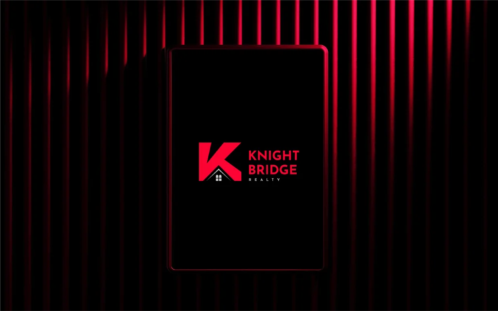
Knight Bridge Realty is a real estate brand focused on trust, prestige, and modern living. The project features a bold visual identity built around a distinctive K-shaped logo incorporating a roof and window motif, symbolizing strength, protection, and opportunity. A striking red, black, and gray color palette paired with clean, modern typography creates a professional and confident brand presence. The brand guidelines establish a consistent visual system across logo applications, color usage, typography, stationery, and branded mockups, reinforcing the company's commitment to reliability, premium service, and excellence in real estate.
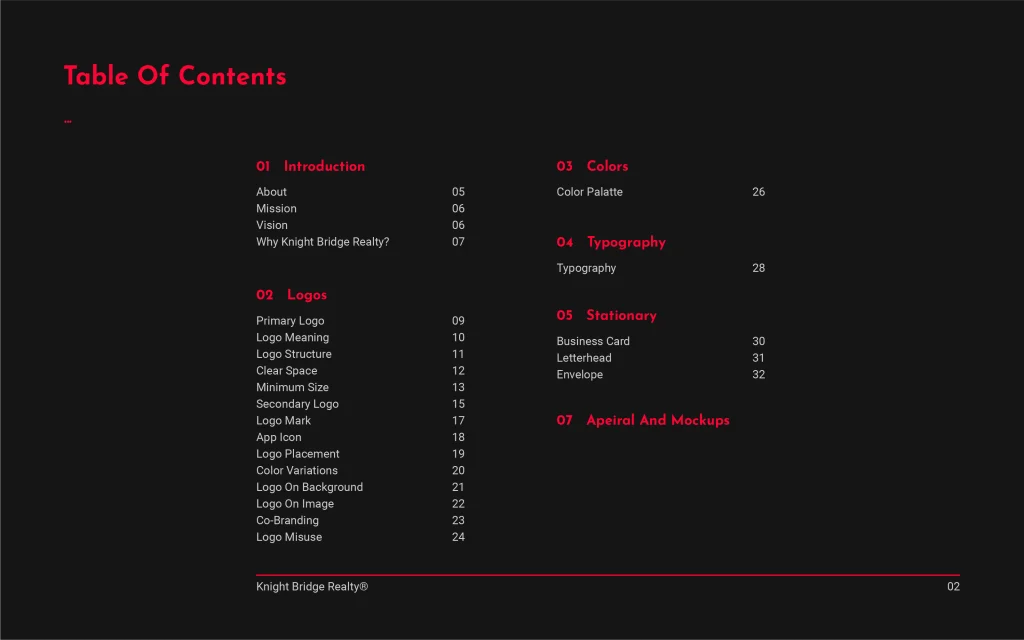
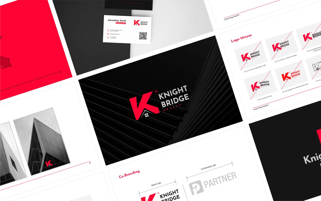
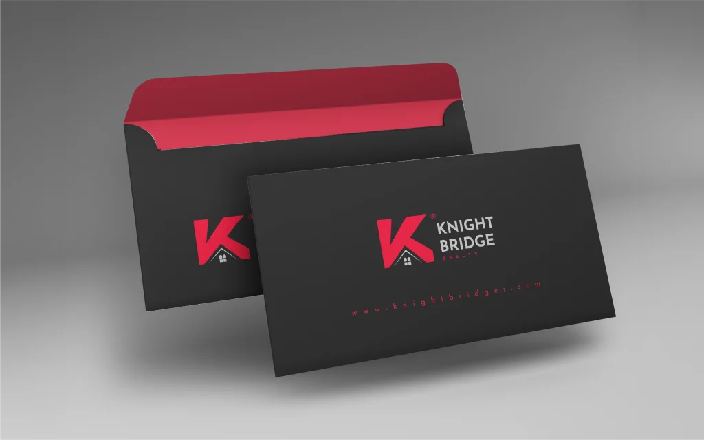
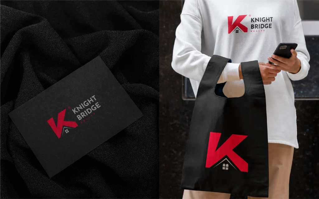
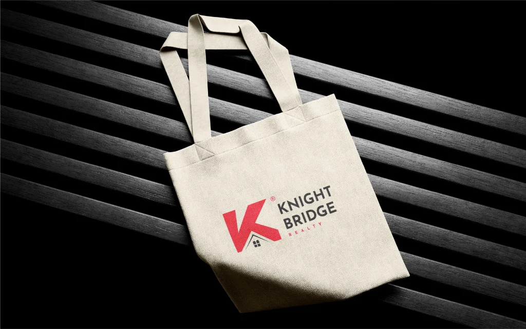
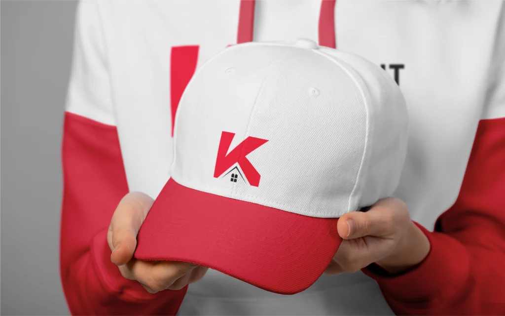
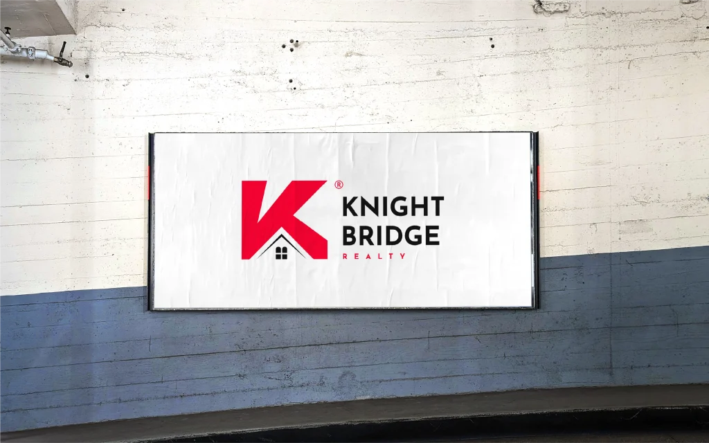
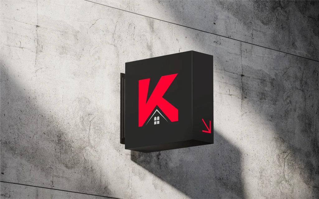
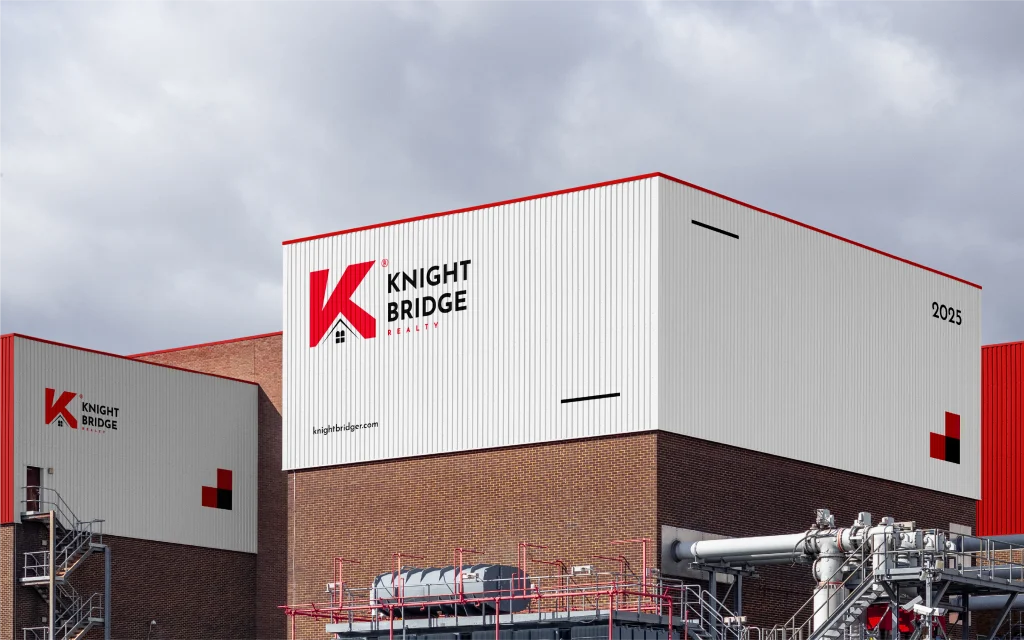
Logo Design, Brand Identity Design, Brand Guidelines, Visual Identity System, Stationery Design, Brand Applications.
Tell us about your company and your timeline. We’ll reply with a recommended scope and next steps.
Blending Moroccan architectural heritage with elegant hospitality branding and geometric artistry.

Building consistent digital tech branding through bold logos and comprehensive visual guidelines.